How to Build a Perfect Graph

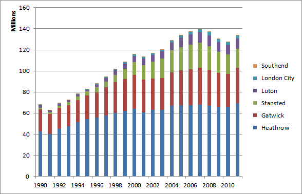
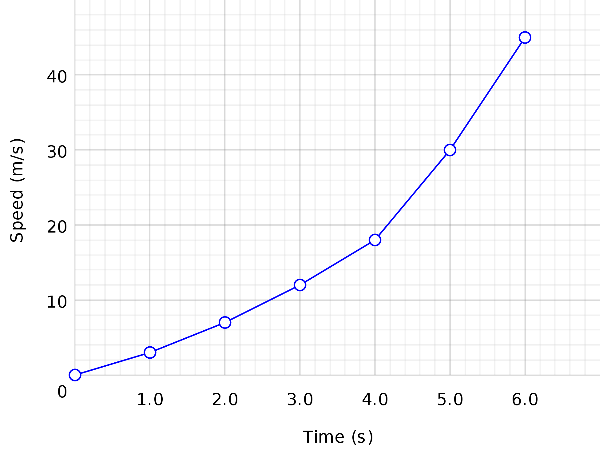
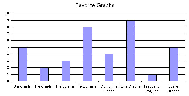
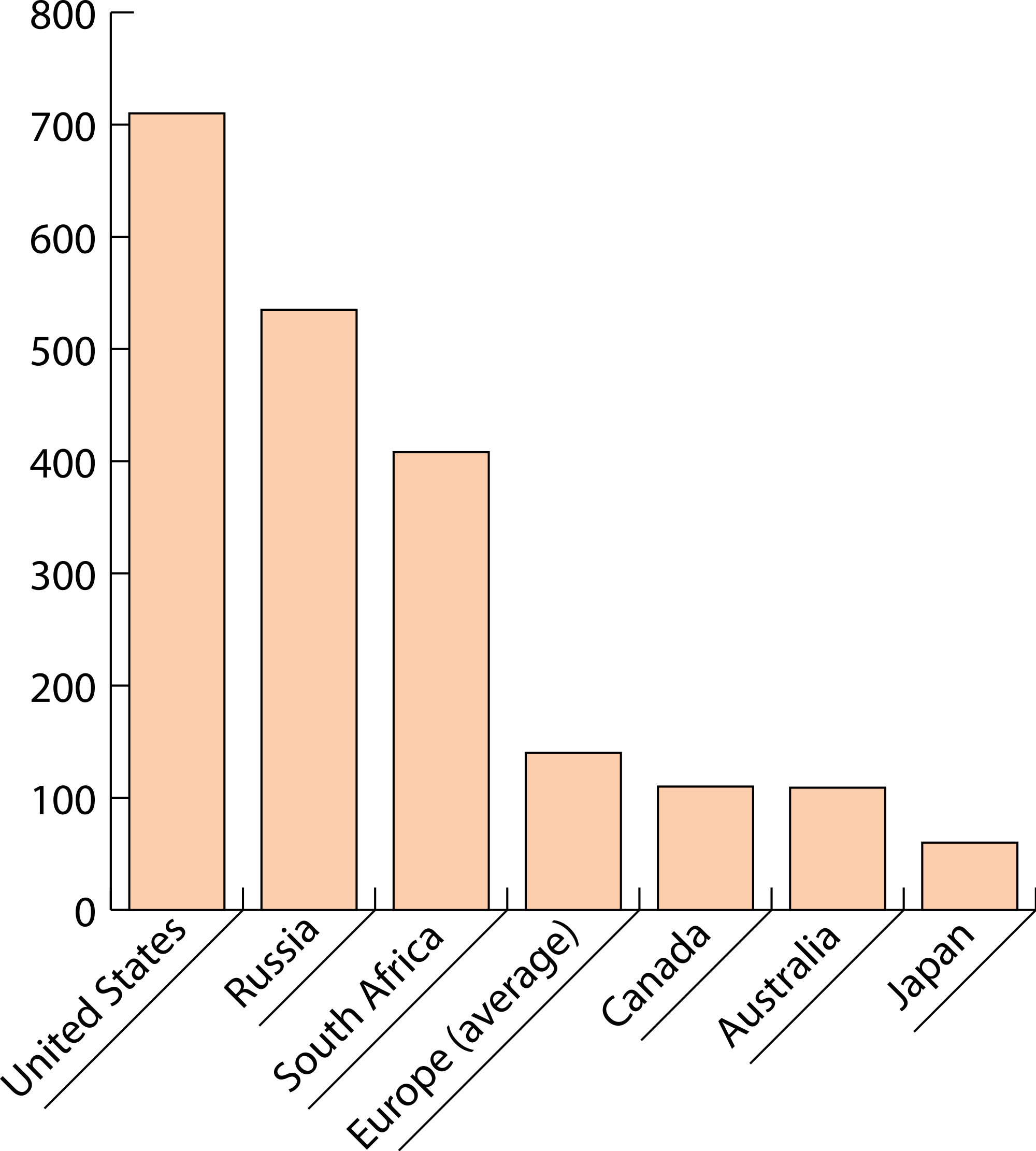
In data science, graph is one of important visualization tool. It helps us to represent and communicate patterns and trends in simple, clear and effective fashion. Graphs also facilitate comparison between two or more time series, and appreciate their significance readily. They can provide us an overall picture of time ... read more


8 Things You Must Know About Statistics

The word “Statistics” which comes from the Latin word status, meaning a political state. It originally meant information useful to the state, such as information about the sizes of populations and armed forces. The word statistics also refers to “numerical facts systematically arranged” in the first place. That’s why the word s... read more


7 Important Charts to Visualization Trends and Patterns

Visualization is a very powerful concept to understand complex trends and patterns buried in statistical data. There is a range of charts for different types and dimensions of data. Following are 7 charts often used to visualize statistical data: 1. Simple Bar Chart: A horizontal or vertical bars of equal widths and ... read more


Visual Hacks to Understand Statistical Data

In statistics and data science, diagrammatic representation plays important role in quick and effective understanding of complex trends and patterns in data. Diagrammatic representation has several advantages over tabular representation of figures: beautifully and neatly constructed diagrams are more attractive diagrams, being a visual display, leave more effective and long ... read more


5 Rules to Construct Frequency Distribution

Tabular organization of data showing the distribution of data in classes or groups, along with the number of observations in each class or group, is called a frequency distribution. The class frequency refers to the number of observations in a particular class. Frequency distributions is a powerful statistical tools which ... read more


More blog posts