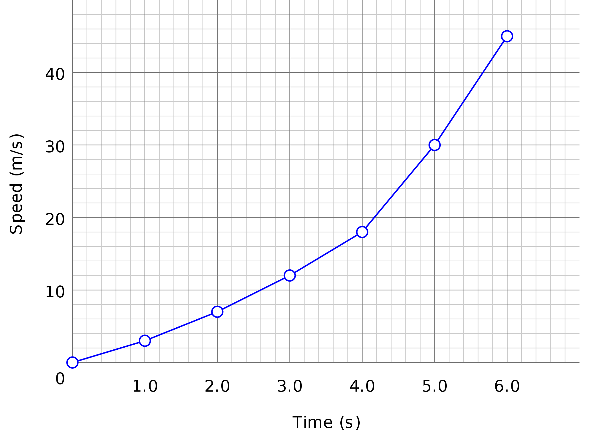
Visualization is a very powerful concept to understand complex trends and patterns buried in statistical data. There is a range of charts for different types and dimensions of data. Following are 7 charts often used to visualize statistical data:
1. Simple Bar Chart:
A horizontal or vertical bars of equal widths and lengths proportional to the values they represent is called simple bar chart. As the basis of comparison is linear or 1-dimensional, the widths of these bars have no significance but are taken into account to make the chart look attractive.
It is good practice that the space separating the bars should not exceed the width of the bar and should not be less than half of its width. The bars should neither be exceedingly long and narrow nor short and broad. The vertical bar chart is an effective tool for presenting a time series and qualitatively classified data whereas horizontal bars are useful for geographical or spatial distributions. If data do not relate to time, it should be arranged in ascending order before charting.
2. Multiple Bar Chart:
Two or more characteristics corresponding to the values of a common variable in the form of grouped bars is shown by a multiple bar chart. There lengths are proportional to the values of the characteristics. Each of it is shaded differently to aid identification. For Example imports, exports and production of a country can be compared from year to year by grouping the three bars together.
3. Component Bar Chart:
A technique in which each bar is divided into two or more sections is known as component bar chart. And proportional in size to the component parts of a total being displayed by each bar. Component bar chart are used to represent the cumulation of the various components of data and the percentages.
4. Rectangles and Sub-divided Rectangles:
The area of rectangle is equal to the product of its length and breadth. To represent a quantity by a rectangle, both length and breadth of the rectangle are used. Sub-divided rectangles are drawn for the data where the quantities along with their components are to be compared.
5. Pictograms:
A pictogram is a popular tool for displaying statistical data using pictures or small symbols. It is said that a picture is worth ten thousand words. It is customary to represent a unit value of the data by a standard symbol or a picture and the whole quantity by an appropriate number of repetitious of symbol concerned. This means the large quantities should be represented by a larger number of symbols and not by large symbols. A quantity smaller than the unit is represented by a part of the picture or symbol used. The symbols or pictures to be used, must be simple and clear. A pictogram is virtually a bar chart constructed in pictorial way as the number of symbols or pictures corresponds to the length of a bar.
6. Pie Diagram:
A pie-diagram, also known as sector diagram, is a graphic device consisting of a circle divided into sectors or pie-shaped pieces whose areas are proportional to various parts into which the whole quantity is divided.
7. Profit and Loss Chart:
This is virtually a percentage component bar chart in which profits can be shown above the normal baseline and losses below the baseline. Since the bars are to be extended from the zero line to show losses, we start from the top.

