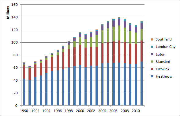
In data science, graph is one of important visualization tool. It helps us to represent and communicate patterns and trends in simple, clear and effective fashion. Graphs also facilitate comparison between two or more time series, and appreciate their significance readily. They can provide us an overall picture of time series data. Oftentimes graphs are also used to make predictions and forecasts. In some cases, one can also locate partition values out for graph representation of source data.
The downside of graphs is that they are abstract representation of source data and the details are always missing. That is why, graphs are known to be less accurate. Obviously it requires us to spend consider time to come up with reasonable graph representation of data, especially when amount data is huge and it requires considerable preprocessing.
In statistics and data science community, following two types of graphs are used quite frequently:
- graphs of time-series or historical data
- graphs of frequency distributions like histogram, frequency polygon, frequency curve and cumulative frequency curve or ogive.
Constructing a Perfect Graph:
To construct a graph first of all you will need to take a starting point, known as the origin, in the left-hand bottom corner of the graph paper. Then through the origin you will need to two straight lines perpendicular to each other. Horizontal line is called X-axis or abscissa whereas vertical line is labeled as Y-axis or ordinate. These two lines together are known as coordinate axes. Some suitable scales must be selected along X-axis and Y-axis. Independent variable is taken along X-axis and dependent variable along Y-axis. Points are plotted and joined to get the required graph.
9 Important Things You Must Keep in Mind While Constructing a Graph
-
Select scale and form of representation in such a way that the true impression of data could be visualized.
-
Graphs must have a clear and comprehensive title. Sub-titles should also be added where necessary.
-
Given source data, a key and footnotes should be provided when necessary.
-
On the horizontal axis, there should always be an independent variable.
-
The graph will give a false impression if the vertical scale will not begin with zero. However, if first item of the data is quite large, a scale-break should be shown between zero and next member.
-
Unless independent variable or the lower limit of the first class interval is zero, horizontal axis does not have to begin with zero.
-
Label the axes of graph properly. It must clearly state both the variable and its units, e.g. “Distance” and “Kilometer”. “Sales” and “Dollars”, etc.
-
If there are more than one curves, they must be clearly distinguished either by different colours or by differentiated lines (solid, dashed, dot-dashed etc).
- The graph should not be loaded with too many curves.

