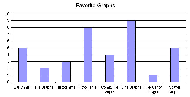
In statistics and data science, diagrammatic representation plays important role in quick and effective understanding of complex trends and patterns in data. Diagrammatic representation has several advantages over tabular representation of figures:
- beautifully and neatly constructed diagrams are more attractive
- diagrams, being a visual display, leave more effective and long lasting impression on the mind of reader
- making unwieldy data abstract and intuitive at a glance.
- comparison of different trends is easier with diagrams
Diagrams have some disadvantages too;
- diagrams are less accurate than tabular data
- cost money and time
- amount of information conveyed is limited.
Visuals of diagrammatic representation are excessively used in business and administration. Different types of diagrams commonly used for displaying statistical data are described below:
1. Linear or 1D Diagrams
They consist of simple bars, multiple bars and component bar charts. In these charts, values are represented only by one dimension, generally length of the bar.
2. Area or 2D Diagrams
They consist of rectangles, sub-divided rectangles and squares - areas of which are proportional to the values of the given quantities. Typically, these charts are used to represent data having moderately large variations.
3 Cubic or 3D Diagrams
They are in the form of cubes and cylinders whose volumes are proportional to the values they represent. These diagrams are used when the variation among the values of the data to be portrayed is so large that even the square roots of the values concerned fail to reduce the variation appreciably.
4 Pie-Diagrams
They are in the form of circles and sectors. The areas of circles or sectors are in proportion to the values they represent or compare.
5 Pictograms
They consist of pictures or small symbolic figures representing the statistical data. A pictogram is an effective way of visual comparisons. For example, we can compare the armed strength of various countries by drawing pictures of the number of soldiers, where each pictorial soldier may denote, say, 1,000 soldiers. In a similar way, the production of wheat can be compared by means of the pictures of wheat bags of a specified size. It is essential to repeat the pictures a number of times to represent the differences in magnitudes.
The following points should be kept in mind while drawing diagrams:
- an appropriate scale consistent with the size of paper available and the size of the data to be represented, should be chosen and indicated either at the side or at the bottom of the diagram. This scale must start at zero.
- a diagram must have a title, which should be brief and self-explanatory. Sometimes a key, footnote or source will also be necessary.
- a diagram should be shaded, coloured or cross-hatched to show the different parts, if any.
- lettering should be shown horizontally.

