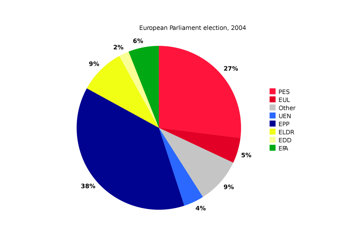
A circular statistical image divided into sections to illustrate the numerical ratio is known as a pie chart. In a pie chart, the arc length of each segment is similar to the ratio of the quantity that it shows. In statistics, pie charts are used to visualize data, specifically the relative data. In the business world and mass media pie charts are widely used.
Let’s take a look at an example, say that there are two parties in election, party X and party Y. If the pie chart is divided into two equals parts that means the both parties will get 50% votes. Let’s say one party gets 75% and other 25%. Then the pie chart will not be cut down equally in two parts but one part would be 75% and other 25%.
Pie charts are mostly used to show the percentage or proportional data. Mostly the percentage represented by each category is provided next to the corresponding slice of pie. Pie chart is considered a good tool to display data of 6 categories or fewer groups.
Pie charts received criticism and many experts recommend to avoid them in data visualization and interpretation. Research has shown that it is difficult to compare different sections of a given pie chart or compare data on various pie charts. In most cases, the pie chart can be replaced by other plots such as bar chart, box plot or dot plots.

