Bar chart and histogram chart both use vertical bars and both are used to aggregate data. The main difference between them is that the bar chart is defined over 2D data - one dimension applies to x-axis and the other to y-axis. On the other hand, histogram is only apply to 1D data. In histogram, y-axis becomes the count of that data.
Bar chart is a common statistical tool for data visualization. Let’s take an example of the housing data with increasing size in square feet 1500, 1600, 1700, 1800, 1900 and 2000 with cost of 72000, 94000, 88000, 55000, 121000 and 59000, respectively. Here the question is that is this data linear? Obvious answer would be “No” because as size increases, the cost jumps up and down. That means there is is no linear line through the given data.
Bar graphs can provide us kind of finer visuals by pooling the multiple data points together into an individual bar. In above example, this can help us to understand relationship of dependent variable of cost to size of house in much better way. The bar doesn’t give us linear relationship but a sense of pattern in data which wasn’t obvious from looking at the individual data points. Hence bar charts helps you to pool together groups of data into single bar for the ease of understand.
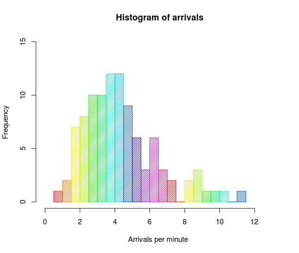
Histogram is only applied to 1D data. In histogram y-axis becomes the count of that data. Let’s take an example of fictitious data set of monthly income, say that the monthly income of some employees are 1327, 1371, 1221, 1471, 1430 and 1260. This data is contrived so that in histogram case you will need to make bar chart that concerns itself with only with frequency. When we plot histogram it will group these salaries in different buckets.